Anyone got any logo ideas?
I'm seriously, SERIOUSLY at a creative brick wall.
Nothing will a football, football helmet, pennant, or stealing the ESPN design (I've been through every one of those... even the last one *cough*).
...
Forum rules
NOTICE: Please be sure to check the CFP Message Board Rules and Regulations and the Read Me page before posting.
NOTICE: Please be sure to check the CFP Message Board Rules and Regulations and the Read Me page before posting.

-
openSkies

- Administrator

- Posts: 1288
- Joined: Wed Dec 28, 2005 4:10 pm
- Location: Boston, MA, USA
- Contact:
The new CFP website.
Right now, the logo is what you see up top (just text... the guy kinda goes with it, but its not logo-material).
I'm trying to come up with something that would make a good logo.
If you look at someone like, let's say, ESPN...
It's their company name, stylized with a line cut-out of the top of the letters.
Simple, easy to recognize, and it's a good logo (can be printed on anything and still maintain it's high quality).
If you take the football player in the logo up top that we have, he won't do well in print.
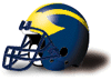
I've tried making the "CFP" fit into the shape of a football. It's lame, too typical. Football helmets are lame... I think? I don't know, you guys let me know if they are or aren't. I even tried blatantly copying ESPN's logo. Doesn't work, haha.
I've also experimented with some random shapes. Arrows, and little boxes, etc. Things like that. If anyone has an idea, try and tell me what it is... or draw it in MS Paint on your comp. Doesn't have to be nice, just get the idea across
Right now, the logo is what you see up top (just text... the guy kinda goes with it, but its not logo-material).
I'm trying to come up with something that would make a good logo.
If you look at someone like, let's say, ESPN...
It's their company name, stylized with a line cut-out of the top of the letters.
Simple, easy to recognize, and it's a good logo (can be printed on anything and still maintain it's high quality).
If you take the football player in the logo up top that we have, he won't do well in print.
I've tried making the "CFP" fit into the shape of a football. It's lame, too typical. Football helmets are lame... I think? I don't know, you guys let me know if they are or aren't. I even tried blatantly copying ESPN's logo. Doesn't work, haha.
I've also experimented with some random shapes. Arrows, and little boxes, etc. Things like that. If anyone has an idea, try and tell me what it is... or draw it in MS Paint on your comp. Doesn't have to be nice, just get the idea across


-
mountainman


-
colorado_loves_football
This is where the Chicago Cubs logo is located.
http://www.chicago-cubs-baseball.com/
In 'my' design, the C is much thinner, almost like a 'ring'.
The F occupies most of the middle, and the P, is almost like a subscript.
That's maybe not the best description, but that's the logo I created, in a nutshell (no pun intended).
http://www.chicago-cubs-baseball.com/
In 'my' design, the C is much thinner, almost like a 'ring'.
The F occupies most of the middle, and the P, is almost like a subscript.
That's maybe not the best description, but that's the logo I created, in a nutshell (no pun intended).
Last edited by colorado_loves_football on Wed Jan 11, 2006 4:26 pm, edited 4 times in total.
Return to “General Discussion”
Who is online
Users browsing this forum: No registered users and 43 guests